Your website stands as the cornerstone of your marketing efforts as a wedding vendor. It serves as the central hub where all your online platforms send traffic, whether it’s Instagram, Pinterest, or TikTok. If your website fails to convert visitors into clients, you’re missing out on potential couples every single day.
Creating a website that captures attention and guides potential clients seamlessly through their exploration journey is crucial. Each page plays a vital role in this process, providing valuable insights, forging connections, and ultimately driving conversions.
Today, we’ll explore the important pages your website should feature, along with a checklist to ensure your website has everything it needs to succeed.
Homepage:
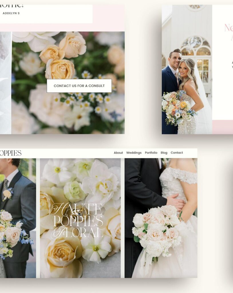
Your website homepage serves as the virtual front door to your business and should make a memorable first impression. It should clearly communicate what you do, who you serve, and why potential clients should choose your services. Your home page needs to communicate three main things:
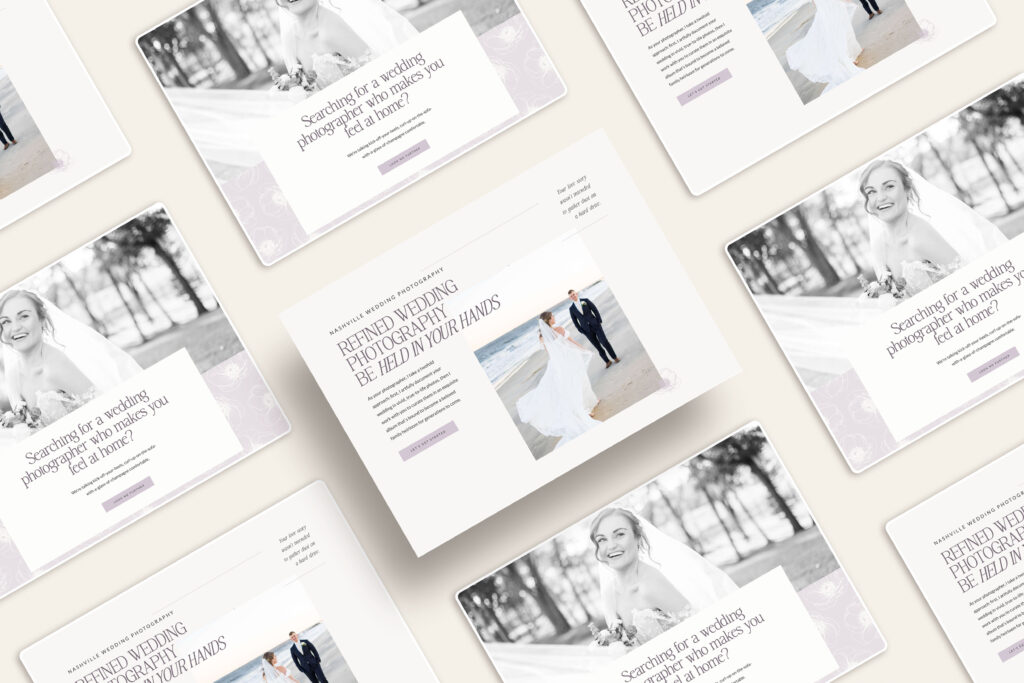
1) What do you offer, and where are you located? This needs to be clear and on the very first section of your website. Trust me: a florist, photographer, and planner’s website can all look the same. Make it clear what you do and where you are located!
2) How it will benefit your client: Dig deep into your ideal client’s vision. What do they value on their wedding day? What is the greatest wish they have? How are they going to feel while working with you?
3) What to do next: This is where your Call To Action comes in! Your CTAs will depend on what you offer and your sales funnel. But ultimately, it should lead to your contact form or services page.
Wedding Stationery:
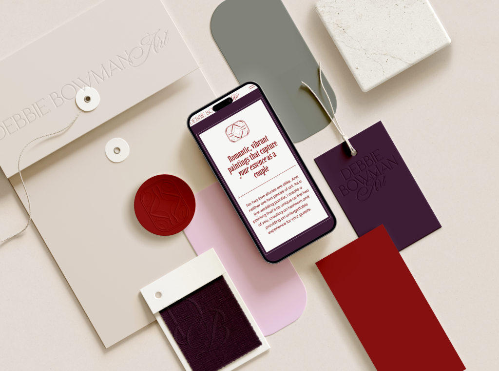
Memorable heirloom stationery for your wedding, with recyclable papers, eco-friendly inks, and all handmade in New York.
Atlanta Planner:
A wedding planner based in Atlanta, planning heart-centered weddings for couples who want their guests to have the best night ever and leave in awe.
About Page:
Your About page is an opportunity to share your brand story and connect with potential clients personally. Use this page to communicate your values, mission, and passion for what you do. It needs to have:
- A clear, professional photo(s) of you.
- An About You section that outlines who you are and why you can relate to your client.
- An outline of your team (if you have one).
- Your Brand Manifesto. What sets your brand apart? What does your team provide that makes you unique?
- A Call To Action: How can they reach out to you?
- Press & Awards
Services Page:
This page should showcase your services and highlight examples of your work through a portfolio of past projects or events. Be sure to include testimonials from satisfied clients to build credibility and trust.
Don’t have a separate testimonial or portfolio page. Remember: your audience will be on your website for under 3 minutes. Keep it simple, keep portfolios on your services page, and have the testimonials spread throughout the website on every page.
- An outline of your packages focused on the value you offer. It’s not just about 8 hours of planning or 10 hours of photography—what is the value of what you offer? WHY do they need it? Back these up with client testimonials throughout this page to highlight the value.
- An average investment or pricing range. Price transparency is essential, especially for Millennials & Gen Z. If you don’t have pricing ranges listed, you will miss out on leads. End of story.
- Images of your best work. Your website galleries aim to show a wide variety and the best of the best. You don’t need 17 weddings at the same venue, even if it’s your favorite venue. The purpose of your galleries is to get them to want to ask more. Yes, you heard me; I want them to ask you for more.
- A Call To Action: How can they reach out to you?
Blog Page:
A blog is an excellent way to establish yourself as an expert in your field and engage with potential clients on a deeper level. Use your blog to share valuable content, including wedding planning tips, industry trends, and real wedding features. Your blog needs:
- Easy to read title and an image for each post.
- Subheadings in easy-to-read fonts, colors, and sizes. (H1, H2, H3)
- A “Next” and “Back” button so people can read older posts.
- A sidebar. This can include information about you, a link to your newsletter sign-up form, the blog categories, etc.
- Plenty of visual blank space: Don’t make your blog crowded with text and images! Create a layout that allows the eye to view the page without too much information.
Contact Page:
The contact page is where the magic happens—it’s where potential clients can reach out to inquire about your services. Use this as the final step in your website journey! Whether booking a call or inquiring for more information, your website’s ultimate goal is to get them to contact you.
- Keep your contact form to 5 questions or fewer. In a study by QuickSprout, a form with only three fields saw a conversation rate of 25%. That percentage was reduced to 20% with up to 5 fields and to 15% with more than 6 fields.
- Your email address. This is a must-have! If your contact form doesn’t work, and the couple can’t quickly contact you, they will most likely never book you. Avoid any confusion, and always have your email address clearly listed. I also recommend having this in the footer of your website.
- Include your expected response time. Let the client know you will respond in 24-48 hours (or whatever your timeline is!)
- Reiterate where you are located. Your ideal client might have found you on a variety of mediums – from a Pinterest Pin to a blog post, to Instagram. So, make sure it is clear where you are located, or the area you serve.
Navigation Bar
Your navigation bar needs to be SIMPLE. I can’t stress this enough.
Avoid clutter and keep your navigation bar to the top 5-7 pages. Make them clear, with names that describe exactly what they do. A “Blog” shouldn’t be called “Journal,” and a page about your services shouldn’t be called “Details”.
Drop-down menus should also be avoided, as they can lower page traffic and increase decision fatigue. After viewing data from hundreds of websites, those with drop-down menus often have lower page traffic and engagement rates.
Also, avoid the hidden navigation bar or hamburger menu. This type of menu design can make navigation more challenging for visitors, decreasing the likelihood that they will find the information they need. Your navigation is to guide, not hide!
Enhance Your Wedding Vendor Website Pages
Your website isn’t merely a collection of pages; it’s a powerful tool that can elevate your business and leave a lasting impression on couples searching for the perfect wedding services. By prioritizing clarity, engagement, and user experience across key pages like the homepage, about page, services/portfolio page, blog page, and contact page, you create a digital ecosystem where potential clients feel seen, heard, and compelled to take action. Remember, your website is your online storefront, your virtual welcome mat—make it inviting, make it informative, and above all, make it unforgettable.
Work With Ava And The Bee on Your Website
If you are ready to take your wedding business to the next level, you need The Beespoke Blueprint. We work with wedding vendors who are ready to stand out so there is no competition. The Beespoke Blueprint isn’t just about upgrading your marketing; it’s about ushering in a complete transformation. We understand that your ideal client and business goals have evolved, and so should your marketing.
Backed with our 20+ years of industry experience and six-figure client results, we know that strategy paired with gorgeous design and captivating copy is the backbone for success. And we don’t just mean booking out your calendar. Inside this package, we start with brand strategy, move into your copy and messaging, then create a custom brand design, and finish with a custom website on Squarespace or Showit that isn’t just gorgeous but is backed with SEO strategies. We work with limited clients each quarter, so reach out today!
Copyright 2026 ®Ava And The Bee LLC | Branding and Website Design by With Grace and Gold | Copy by The Literary Co. | Privacy + Terms | Shop Terms
