
You spent months on your website and optimizing your SEO. You’re even finally starting to post on Instagram consistently. And it worked – YAY! You have finally started getting consistent inquiries from couples who are genuinely excited about working with you.
And then you send a 24 page pricing PDF.
Here is the thing nobody in the wedding industry is talking about right now: the inquiry is not the finish line. What happens after someone reaches out is where the booking actually gets won or lost. And for most wedding professionals, the pricing guide is the biggest conversion leak in their entire business, and they have no idea.
The 15-Page Pricing Guide Era Is Over
Five years ago, the advice was to make your wedding pricing guide comprehensive. Cover everything. Include every package, every FAQ, every process detail, every testimonial. Coaches and educators were literally teaching “give them everything upfront so they have no questions left.” The longer it was, the more professional it looked. A 50-page guide felt like proof that you were serious.
And for a while, that worked.
But buyer behavior has changed, and the couples reaching out to you today are not the same couples who were planning weddings five years ago. They are researching on their phones, comparing multiple vendors at the same time, and making decisions faster than ever. And they are not sitting down with a cup of coffee to read your 50-page PDF. They are opening it between meetings, on their phone, while three other vendor guides are sitting in their inbox. If they cannot find what they need in the first 30 seconds, they are closing it. And if the language feels overly formal, full of industry jargon, or just hard to follow, they are gone.
What converts now is simple. Clear package names they actually understand. Pricing that gives them enough context to know if you are in their range. A next step that is completely obvious. That is it. Everything else can wait for the discovery call.
Less is not cutting corners. Less is respecting their time. And that builds trust faster than any 20-page guide ever did.
The problem is not the format. It is the experience.
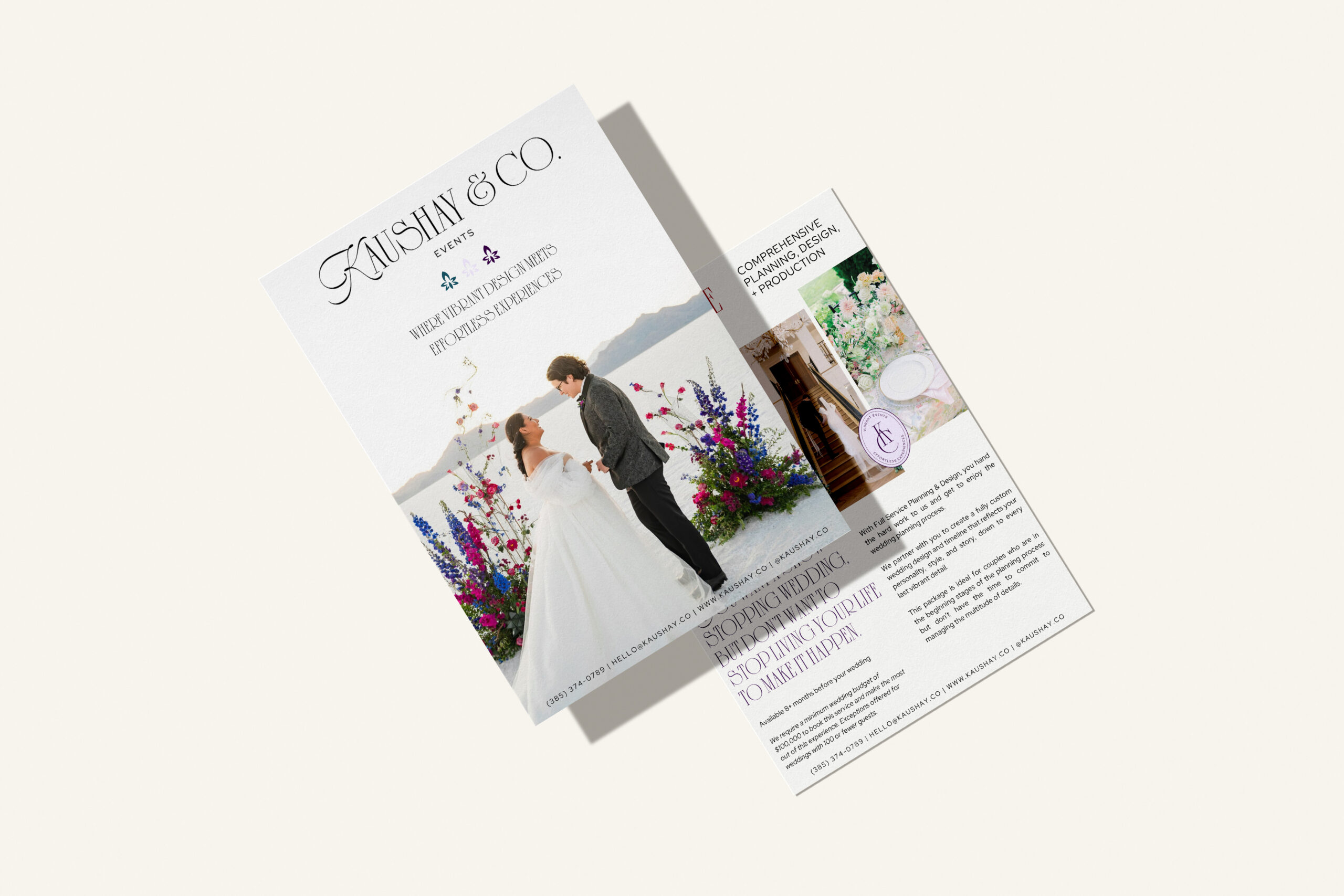
There is nothing wrong with a PDF pricing guide. Some vendors have sales processes where a beautifully designed, easy-to-navigate PDF is genuinely the right tool. Planners who want to forward it to clients. Vendors who need something printable. Sales flows where a document makes more sense than a link.
The problem is not the format. The problem is when the pricing guide — whatever form it takes — does not match the quality and intentionality of everything that came before it.
It does not reflect your brand.
Your website is polished, cohesive, and designed to build trust. Your pricing guide looks like it was put together in a rush three years ago on Canva and has not been touched since. Mismatched fonts. Weird spacing. Outdated images. That disconnect is felt immediately, even if a couple cannot articulate exactly why.
It does not guide clients toward the next step.
Most pricing guides end with something like “let me know if you have any questions.” That is not a strategy. Your pricing guide should be doing the same thing your website does: moving someone intentionally toward a decision, creating desire, answering objections, and making the next step completely obvious.
It is not doing your sales process any favors.
Whether it is a PDF or a website landing page, your pricing guide should be working as hard as the rest of your brand. It should feel elevated, easy to navigate, and aligned with the experience you are selling. If it is not, it is a conversion leak sitting right in the middle of your most important moment.
What A Strong Wedding Vendor Pricing Guide Looks Like
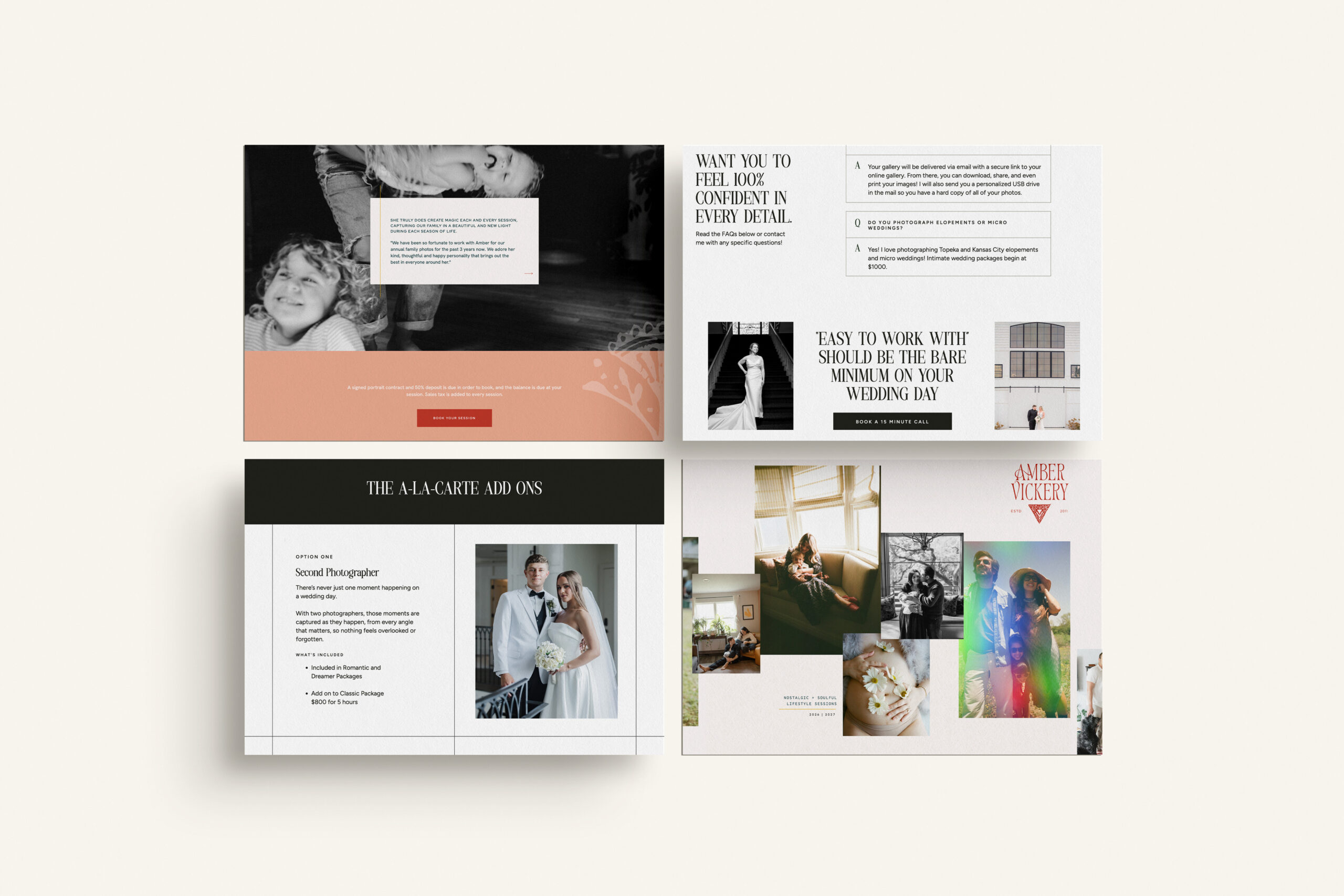
Keep it short
Aim for three to five pages max if it is a PDF, or three to five sections if it is a landing page. Cover your packages, your starting investment, a brief overview of your process, and a clear next step. Everything else can wait for the discovery call.
Use language your couples actually use
Not “bespoke curation” or “artisanal documentation.” If a couple would not say it out loud, it should not be in your guide. Read it back to yourself out loud — if it sounds stiff or formal, rewrite it.
Lead with the transformation, not the transaction
Before you list your packages, remind them what they are actually getting. Not “eight hours of coverage” but “the full morning getting ready through your first dance, so nothing gets missed.” Sell the feeling before you sell the package.
Match it to your brand
Your fonts, your colors, your tone of voice. A couple who just fell in love with your website should open your pricing guide and feel like they are in the same world.
Update it regularly
Your pricing guide should reflect your current prices, your current packages, and the caliber of work you are doing right now. If it has been more than a year, it is probably time for a refresh.
Create a Pricing Guide On Your Website
For a long time, the only option was a document. You designed it, exported it, and sent it as an attachment or a download link. That was the standard, and most wedding professionals are still doing it that way.
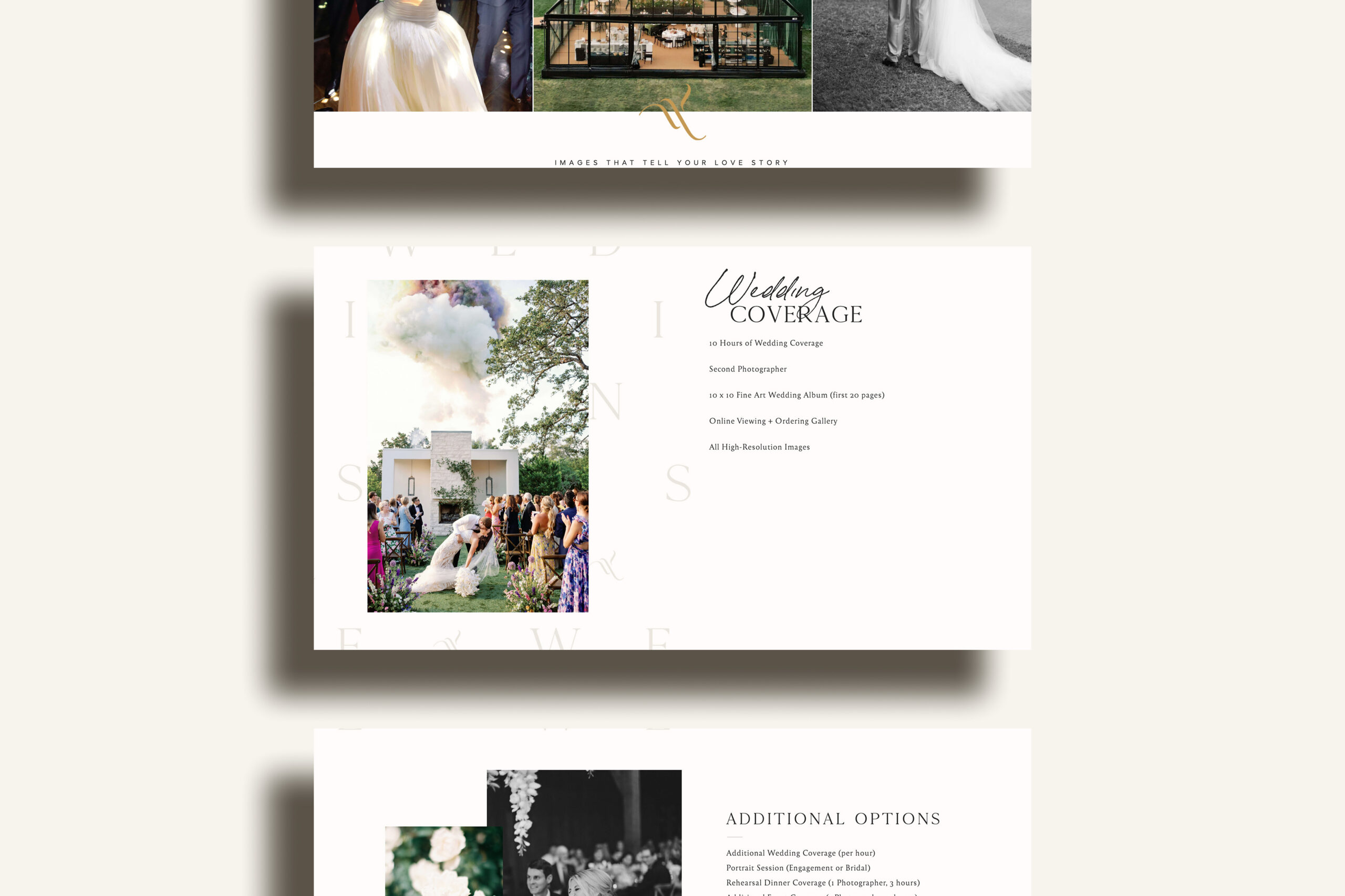
But there is another option that the most intentional wedding businesses have quietly adopted, and it completely changes the experience: A pricing guide landing page lives on your website (instead of in someone’s downloads folder.)
Creating your pricing guide on your website allows it to match your brand perfectly because it is built inside your actual website. It looks beautiful on any device without pinching or zooming. It guides couples through your packages with intention, in the right order, building desire and answering questions along the way. And it ends with a clear next step rather than “let me know if you have questions.”
My favorite part? It gives you real data that you can find inside of Google Analytics. Who opened it, what they looked at, how long they stayed. All of this valuable information to have!
That said, a landing page is not the right fit for every vendor or every sales process. Some businesses genuinely need a document. Planners who forward guides to clients. Vendors whose couples prefer something they can save and share. Sales flows where a PDF just makes more sense.
The point is not that one is better than the other. The point is that your pricing guide — whatever form it takes — should feel like a deliberate, elevated extension of your brand. Not an afterthought. Not something you built years ago and have been sending ever since without a second thought. Your pricing guide is a brand touchpoint. It deserves to be treated like one. If your website is finally ready to reflect the business you have built, and your pricing guide needs to catch up, this is the moment.
Websites & Custom Pricing Guides for Wedding Vendors
Inside every Ava And The Bee website, we make sure your pricing guides are actually built to convert. The right questions, the right flow, the right follow-up experience. That is not an afterthought for us, it is a priority from day one.
The Beespoke Blueprint is our signature service: custom marketing strategy, brand messaging, website copy, full branding, and a custom website design, all built with SEO and luxury business insights from start to finish. Learn more
The Beespoke Collection is our semi-custom option: you pick the Showit design and brand kit, we write your copy, set everything up, and optimize for SEO. High-end and polished, done in around nine weeks. Learn more


Reader's
Favorites


Copyright 2026 ®Ava And The Bee LLC | Branding and Website Design by With Grace and Gold | Copy by The Literary Co. | Privacy + Terms | Shop Terms