I recently had the pleasure of creating a cohesive brand, website, and marketing items for a workshop, called Instabrand! My client Wendy at Apt. B Photography, along with Bud Johnson Photography and Teresa Earnest Social, are hosting a workshop on April 21st 2020, all about Instagram. This day long branding and Instagram intensive its designed for any small business owner who wants to learn how to use Instagram to communicate their brand, connect with customers and create more sales.
The problem they faced was that they were starting from scratch. They needed a brand identity, a logo, a website, Instagram story templates, and a workbook for those attending. They also needed assistance in finding the best platforms to host the website, as well as sell tickets. That is where Ava And The Bee came in! As a digital marketing company for Wedding Professionals, we are able to create a workshop, or brand, from the ground up.
First Step: Creating A Vision Board
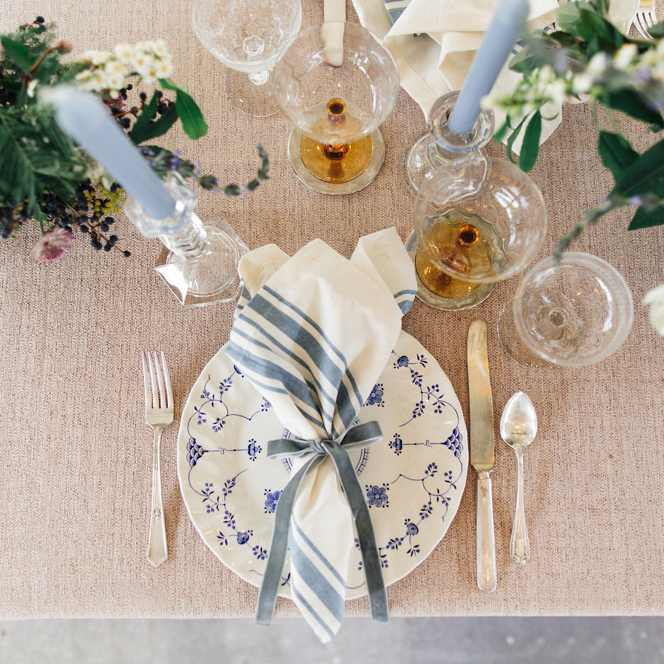
When I first start with a branding client, my first step is the vision board. Wendy and Bud knew they wanted something simple, clean and modern. They wanted colors that popped, with the main color being a mustard or gold shade. Since a mustard color can become overwhelming, I paired it with a deep teal, and peachy pink. All three shades fit well in Apt. B Photography and Bud Johnson Photography’s branding. As you can see in the vision board, I later added their final logo.

Second Step: Create A Logo
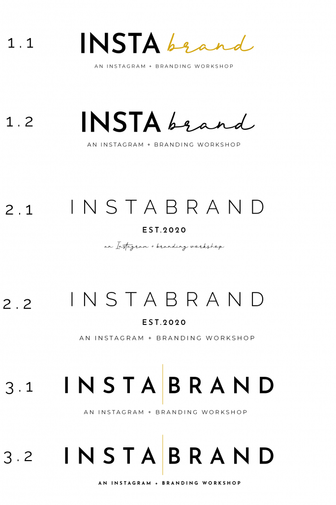
For the Instabrand Logo, the clients wanted a simple logo, with text as the focus. They wanted to stay away from too many flourishes. They also didn’t want it to be feminine, since the workshop is focused for all business owners.
I shared a variety of logo’s, some using various font combinations, other very simple. The first round included 11 options. They narrowed it down to the top 3, and I adjusted from there. In the end they chose variation of logo 3.1, with a bold font, touch of gold, and a tagline under.
I also made a sub-mark, that could be used as a Favicon icon, or for smaller print.
The Final Logo:


Step Three: The Website
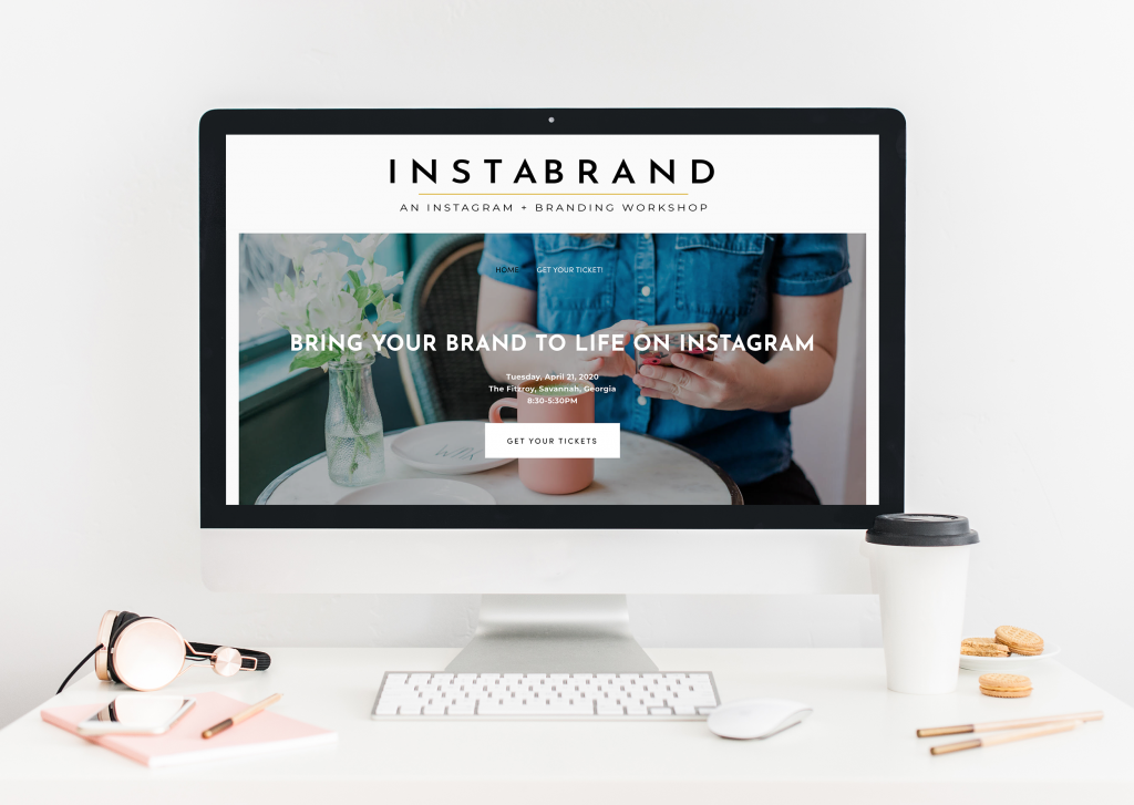
The biggest problem they faced was having a website. They wanted something that allowed them to sell tickets, while also offering a discount code for an Early Bird special. We looked into a variety of platforms, including creating a simple page in LeadPages. We also looked into hosting it on EventBright, however, it doesn’t allow you customized options. The clients wanted to make sure users were able to do everything – view, and purchase, from one place.
In the end, we chose Squarespace. Squarespace is an easy to use platform, that allowed them to have all of the must need items included, at a low monthly price.
The website needed to have information on the course, multiple call to actions, an outline of the day, as well as information on the hosts. The goal for the website was to keep it simple and clean, and lead the viewer into purchasing a ticket.
Throughout the website we added call to actions, in our accent teal color. This leads the user to the product page, where they can purchase either a regular ticket or a VIP ticket.
When building a website for a workshop, it’s not just about the landing page! There are many elements on the backend that needed to be changed and created. This included:
- Creating products and product descriptions.
- Creating Promo Codes to apply to certain products.
- Setting up the SEO, including Alt Images, Meta Descriptions, and site maps.
- Setting up the Squarespace template to include the colors, fonts and correct sizing.
- Adding custom code to the website, to ensure the logo was the right size.
- Setting up the checkout pages, including copy and making the checkout process easy.
- Adding a form to collect the attendant’s information.
- Setting up the checkout emails, so it displayed all of the correct information.
- Adding an announcement bar.
- Setting up a countdown clock, and adding custom script to display on the website.
Step Four: Instagram Story Template
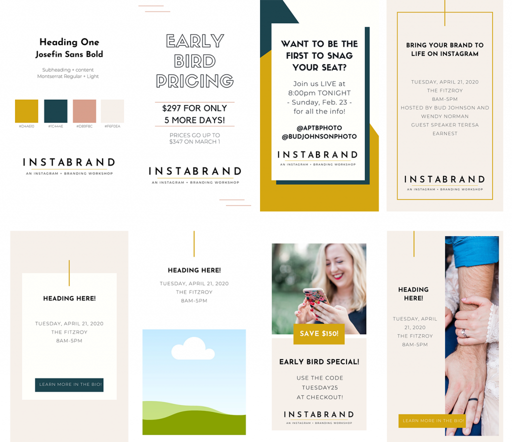
The final step was creating Instagram story templates, that the three hosts could use to promote. To make it easy to edit, I suggested we use the program, Canva. Canva allows you to create items, and share them with others, so everyone could edit as needed.
They needed templates for the following:
- Give-Away Contest
- Early Bird Pricing
- Regular Pricing
- VIP Information
- Misc. promotions
I created 20 templates, so they had a large variety to chose from, and could mix and match. For all of my Canva templates, I turn the first page into a branding sheet. I include the colors, the logo, and branding fonts. This way the client can easily make sure they are using the right branding information each and every time, without having to open up another document.
Instabrand Summary
My creating a cohesive brand, Instabrand is now able to attract the attention of potential clients. I was able to create a vision board, a logo, a website, as well as Instagram story templates. All of these elements come together to create a brand that is modern, simple, but direct.
Interested in attending the Instabrand Workshop in Savannah on April 21st, 2020? Visit here, and book your tickets now!
Copyright 2026 ®Ava And The Bee LLC | Branding and Website Design by With Grace and Gold | Copy by The Literary Co. | Privacy + Terms | Shop Terms


